A list hides the shape of your results
Most journals present your history as a reverse-chronological feed: newest trade on top, scroll for more. It's honest, and it's close to useless for seeing pattern, because a feed has no second dimension. Wins and losses alternate down a single column and your eye has nothing to group them by.
You can read a list for an hour and never notice that four of your five worst days were Mondays, or that a “good month” was one enormous Tuesday and twenty break-even sessions around it. The information is all there. The arrangement isn't.
Sequence
What happened, in the order it happened. Good for recall — you can find the trade you're thinking of. It answers “what did I do on the 14th?”
Shape
The same trades, grouped by day and laid across a grid. It answers a different question: “where do my results cluster, and is there a day that keeps costing me?”
The calendar makes clustering visible
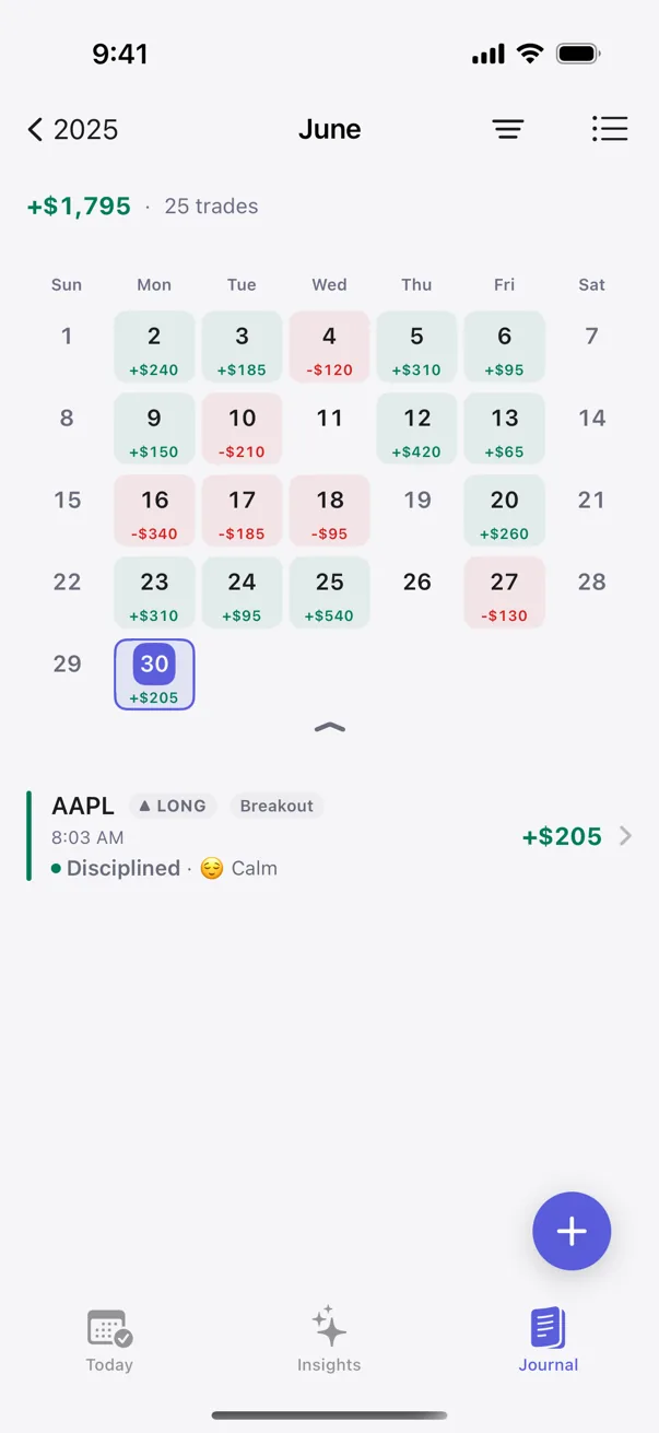
Put each day in a grid cell with its net P/L, and grouping happens for free. A losing streak stops being a scroll and becomes a row of red you can't miss. A revenge spiral — one bad trade, then three worse ones chasing it — shows up as a single dark day instead of four entries you'd read separately and forgive one at a time.
The value isn't decoration; it's that spatial memory does work verbal memory can't. You remember where the red days sit once you've seen them placed. That recognition is the first step toward the only question that matters: is this a real tendency, or did I just notice a coincidence?
Day-of-week and time-of-day tendencies
A calendar is especially good at surfacing two things a list is especially bad at. The first is the day-of-week effect — whether your Mondays, or your Fridays, systematically differ from your baseline. The second is when in the session you trade well, which pairs with the honest finding that the same trader gets different results at different hours (covered in the best time of day to trade).
A calendar can't prove either on its own. It shows you what happened, arranged so a candidate pattern jumps out. Whether that candidate is signal or noise is a separate question, and it's the one your eye can't answer.
What a calendar can, and can't, tell you
This is the honest limit, and it's worth being blunt about. A calendar is a presentation. It shows results grouped by date, with no judgment about whether a grouping means anything. Three red Mondays in a row is either the start of a real weekday leak or three ordinary losing days that happened to land on Mondays — and nothing about the grid distinguishes them.
The distinction takes a sample and a test: enough Monday trades to compare against your other days, and a check for whether the difference is bigger than chance would produce anyway. That's the line between noticing a pattern and trusting one. A calendar gets you to the first. It was never built to do the second, and a tool that pretends otherwise is selling you a hunch with a grid around it. If you want to sanity-check what a run of days actually cost you, the P&L calculator does that arithmetic in isolation.
Net P/L, not a streak counter
A calendar view invites a temptation worth naming: turning days into a game. Colored streaks, “consistency” badges, a longest-green-run number — plenty of tools add them, and they quietly corrupt the record. Once a green day is a score, you have a reason to book a small winner early to keep the run alive, or to not log the red one at all.
A calendar earns its keep only if every cell tells the plain truth: the net result of that day, gains and losses weighed the same, no streak to protect. Results you're tempted to game are results you'll eventually distort. (More on why scorekeeping poisons a journal: why streaks hurt a trading journal.)
Seeing it, then testing it
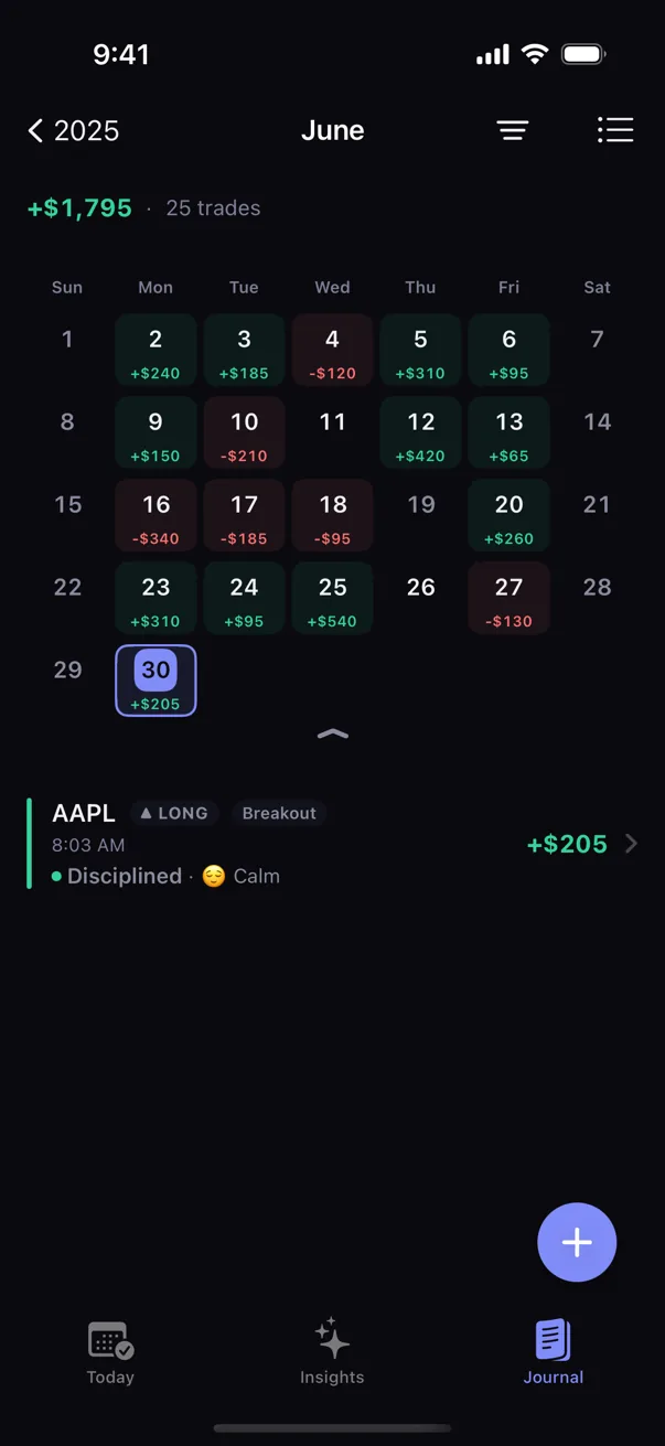
Kyra's Journal shows your trades two ways: a searchable, filterable list and a P/L calendar with a week strip and a month grid you can toggle between. Each day carries its true net result, and there are no streaks anywhere in it. The calendar respects whatever you've filtered or searched, so you can look at just your breakout trades, or just your FOMO ones, laid out by day. Empty weekends fold away on their own unless you actually trade them.
And when a day-of-week or time-of-day tendency shows up in the grid, pattern detection is the part that tells you whether it's real — comparing enough trades to separate a habit from a coincidence, on-device, with the sample size shown on the card. The calendar helps you notice. The engine helps you trust. You need both, and most tools ship only the first.
Educational only. Not financial or trading advice. Specific outcomes vary with strategy, market conditions, and individual circumstances.